Google Account
Google Account
Google Account
Client: Google Year: 2018

Overview
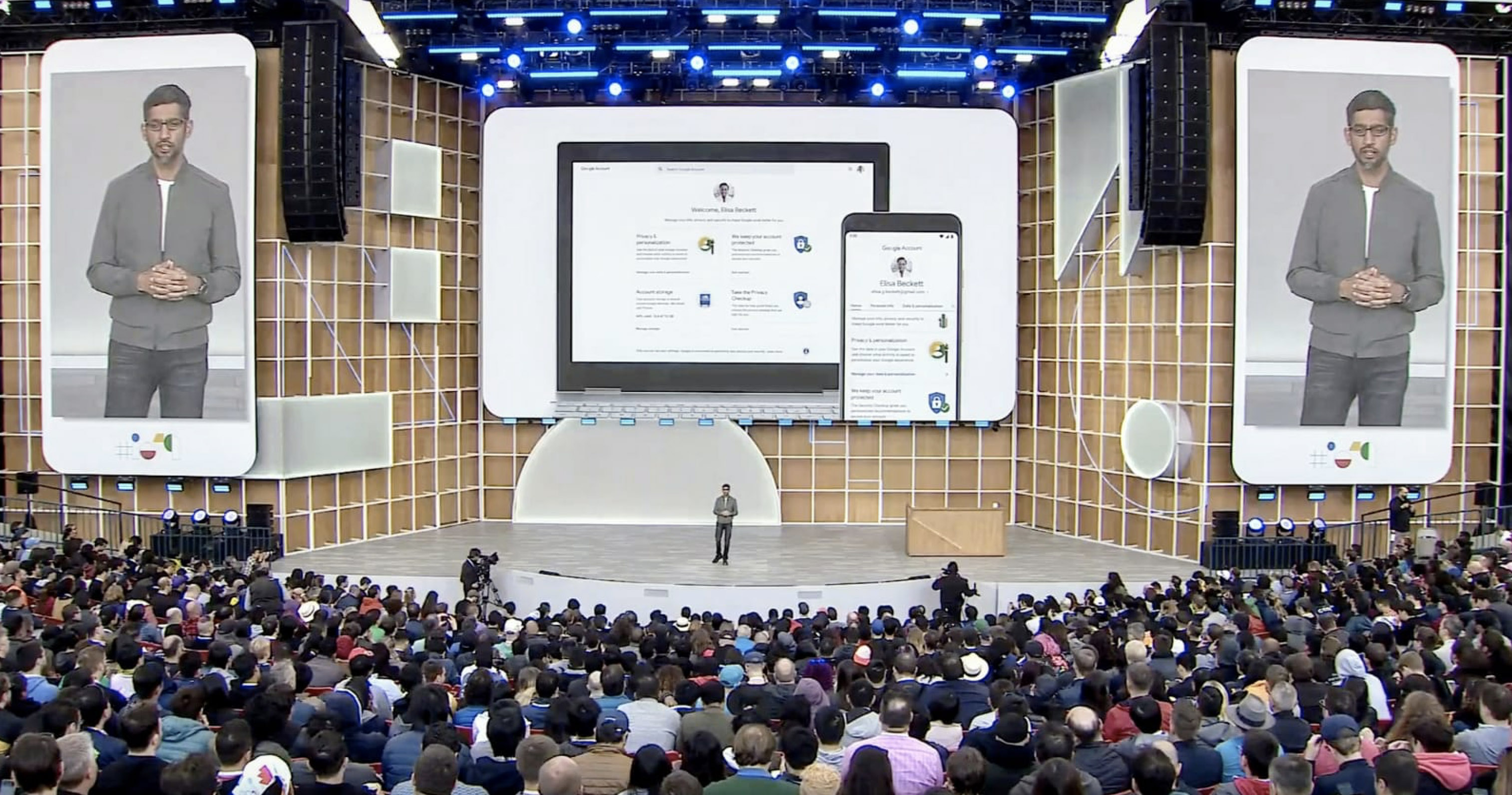
GDPR / Privacy Regulation, defined a new level of User Privacy to be addressed in digital products. My task has been to Re-Define & Re-Shape the new Google Account experience from concept vision towards implementation on Web & Web Mobile, to provide Google Users full control and understanding of shared data. Billions of people have now visited their Google Account and over 20 million people do so every day.
Role
Principal Designer - Freelance.
I was responsable of the design effort from conception to implementation of the MVP and post MVP, in a cross functional team collaboration between 3 offices: Munich, Mountain view & Telaviv.
The Challenge
The Challenge
The Challenge
Driven by the Identity team in Munich the Google Account rewamp, was a crucial step towards more transparency and clarity about user's data, providing full control and understanding.
Google Account is a destination accessible from all Google products, Google search, Youtube, Gmail, Calendar and so on. For this reason the products cross dependencies and overall preferences and controls, not product specifics were foundation to restructure the account. Also leaf pages, as possible direct destination from Google products or Google search results, needed a major design armonisation.
As Google Material 2 was running in parallel, aligning and influencing by web opportunity and limitations the design system in development was a crucial in the design and implementation process, validating and testing solutions.
Structure
Structure
Web desktop →
1920 → 1024
Tablet / Large Handset →
1024 → 720
Mobile →
720→ 320
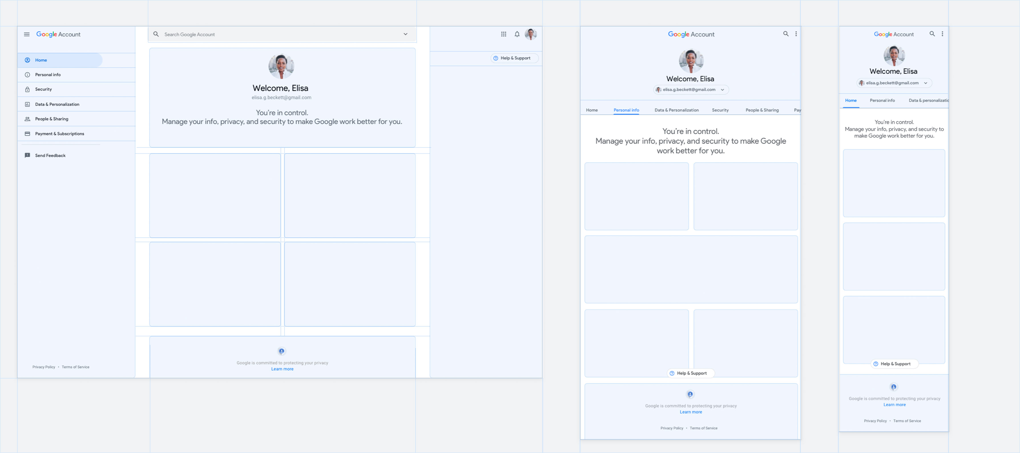
Web Desktop
The web desktop anatomy preserve the persistent left side navigation to offer always an easy access to the main veticals.
The page body filled of actionable contents for a glancable overview.
A right hand openable contexual help panel.
Tablet
On tablet and large handset the side navigation panel switch to a mobile oriented tab solution scrollable according to dimension.
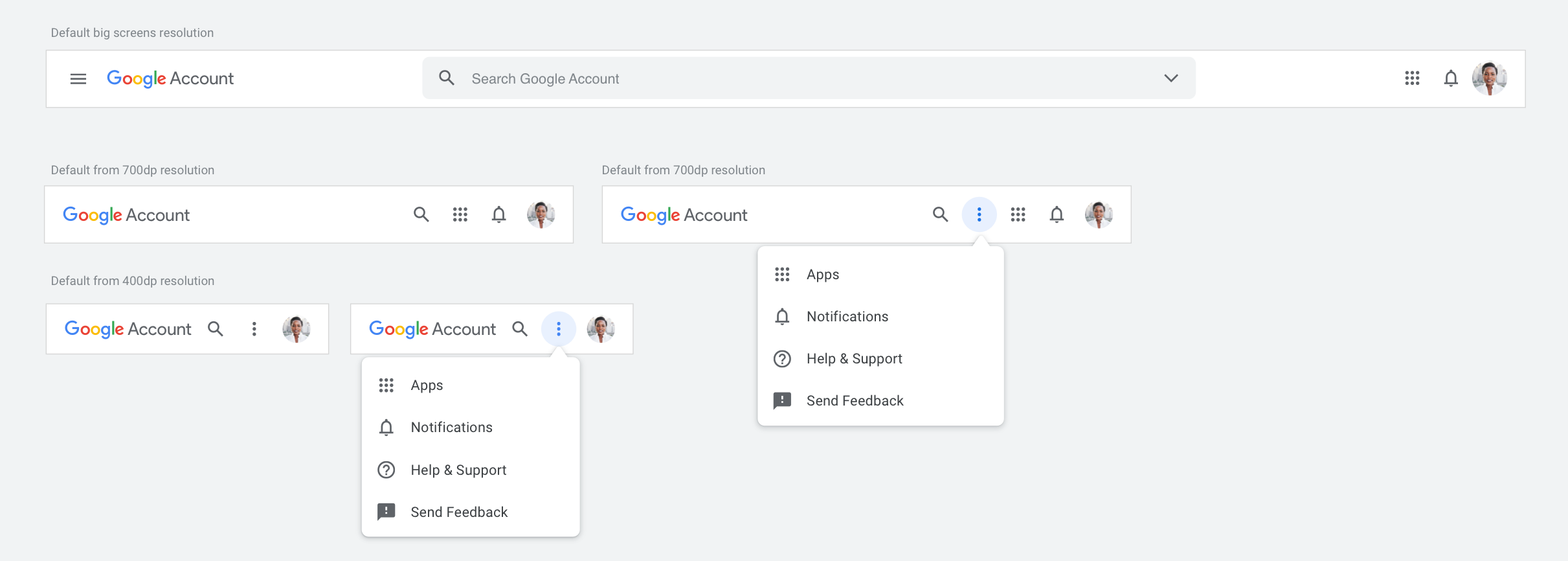
The contextual help lives in both the "more menu" in the top bar and as a floating chip at the content bottom end to ensure visibility and accessibility needed in case of needed support.
Mobile
As per tablet the mobile web experience is mirroring the native mobile with the side navigation panel switched to a scrollable tab solution. The contextual help lives in both the "more menu" in the top bar and as a floating chip at the content bottom end to ensure visibility and accessibility needed in case of needed support.
↓
Design System
Responsive cards and illustration
↓
Design System
Responsive cards and illustration
Google Material Design 2 adaptation and evolution for web desktop platform providing consistency and design coherency, adaptable according to screen sizes and platform on dimension, contents and illustrations and interaction gestures.
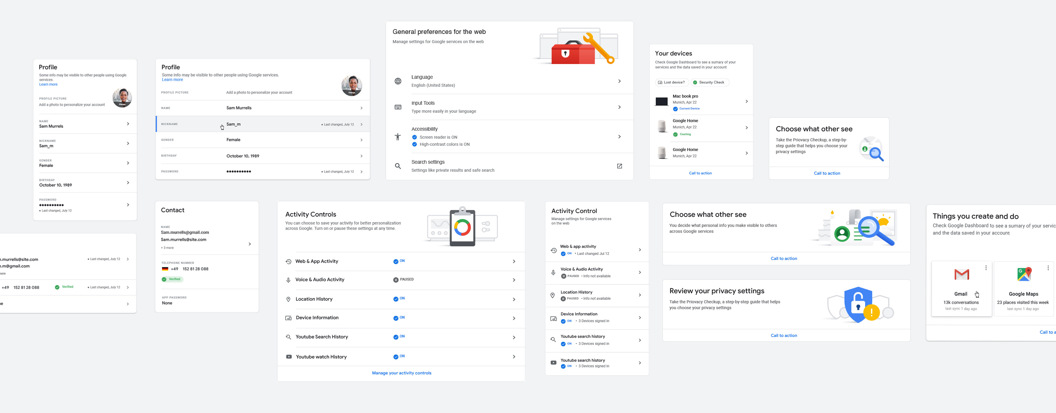
Design rewamp
Design rewamp
Design rewamp
Product MVP released One centralised account destination for all Google products. A new look, a new experience for full control and tranparency.
↓
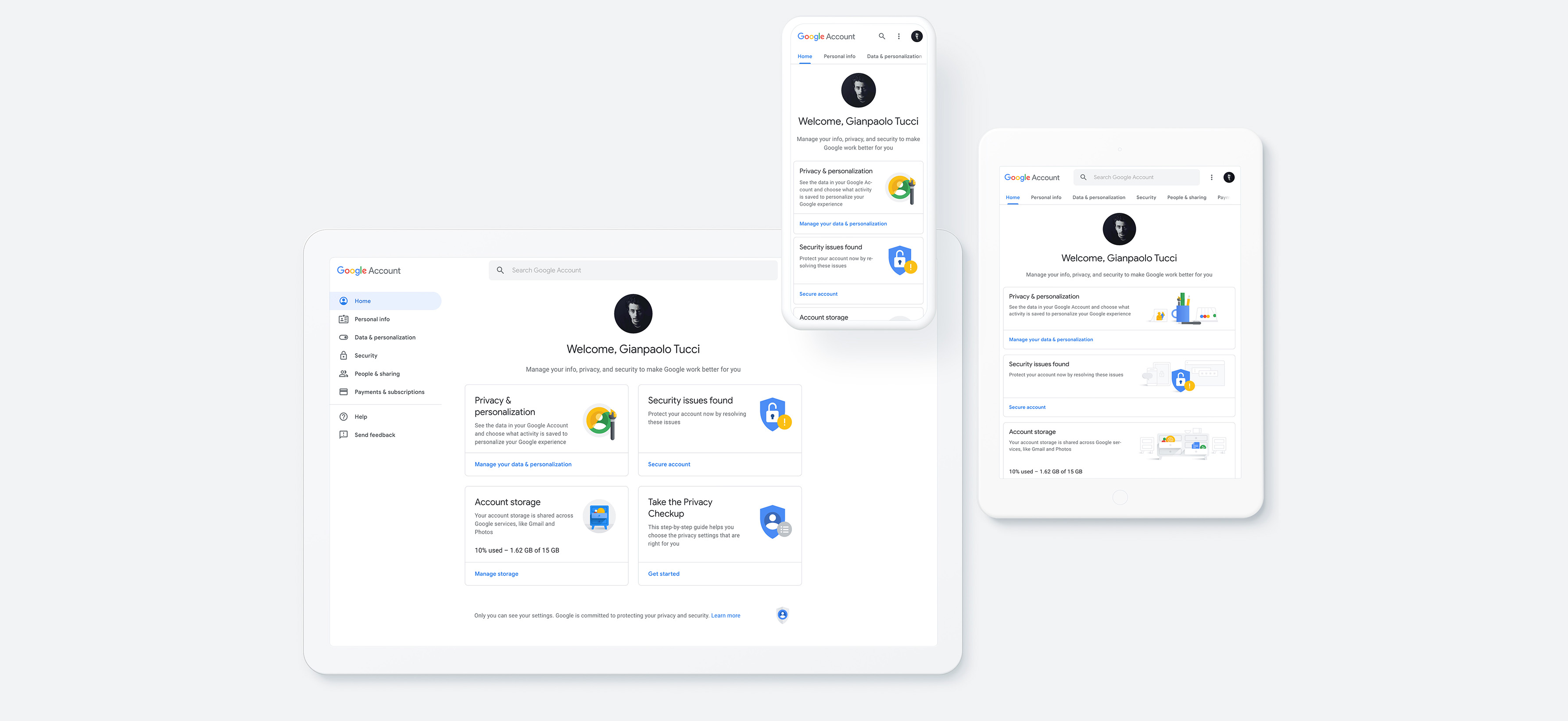
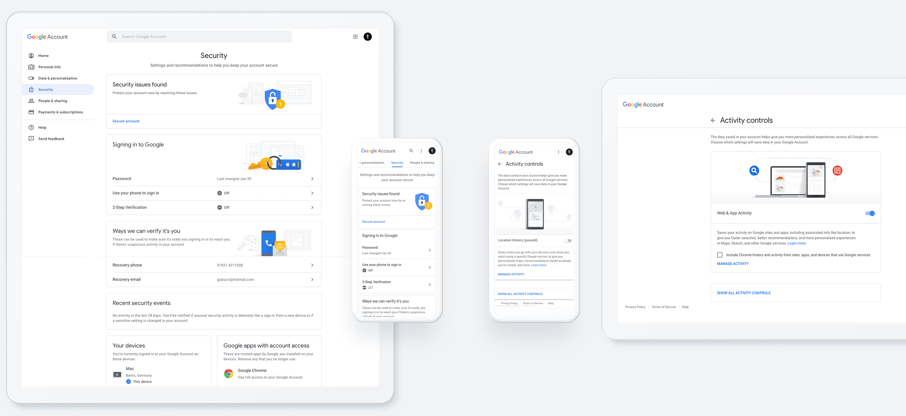
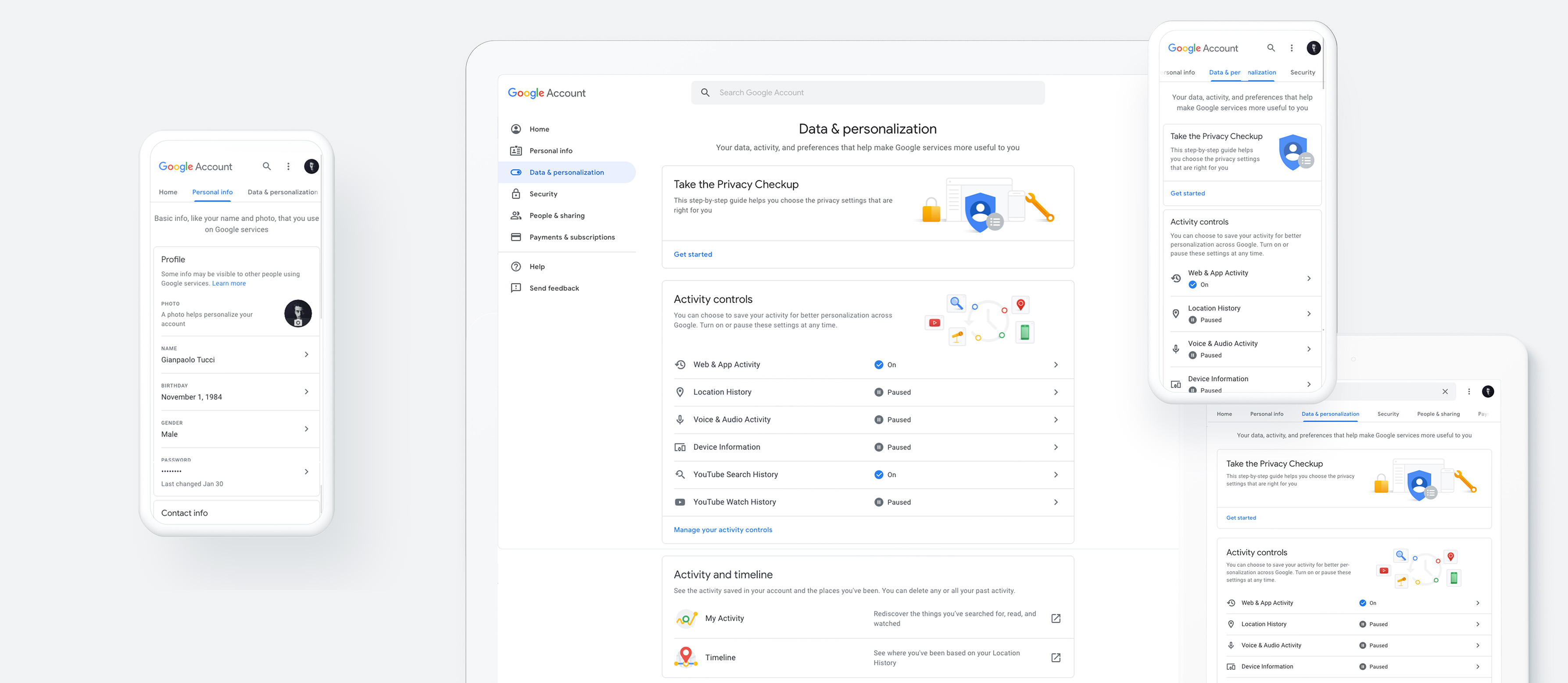
The journey...
The journey...
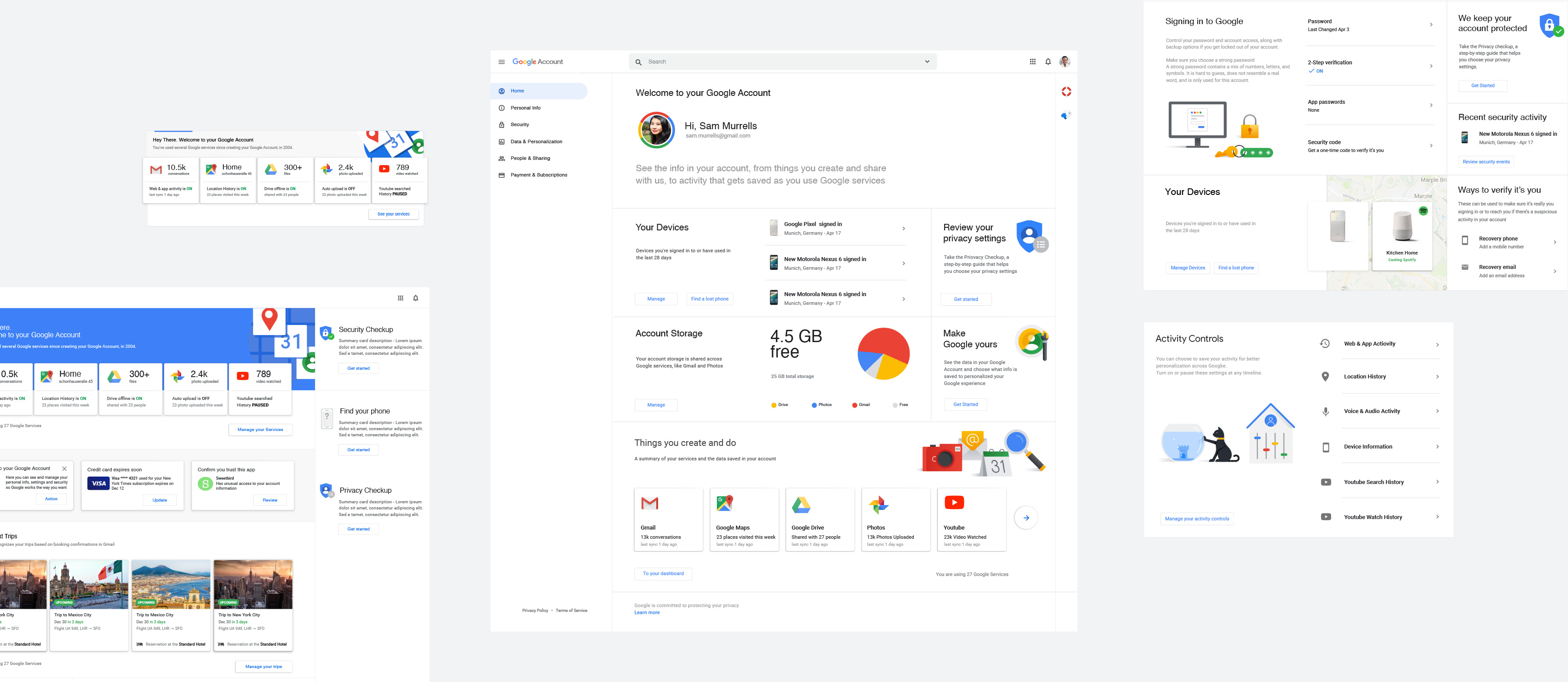
What presented above it's the finalization of a long process of discovery, exploration and alignement towards design proposals, user test and both internal and user's validation.
Structure, layout, cards, help panel, responsivness, product lock up - all has been evolving along the journey with teams collaboration and knowlage, from Identity team, security team and material design team & brand team.
One Google bar product adaptation
At last key defined components that has been adapted for the product and related context, with team coordination.
Teams
↓
Design Manager Andrè Fialho, Principal Designer Gianpaolo Tucci, Illustration / Designer David Divinagracia, Motion / Prototyping / Designer Admir Hadžić, Research Carmen Varga, Tobi Seitz, Copy Estela Arbuco, PO Jan Hannemann
