Moncler Collections
Auditorial withGoogle
Auditorial withGoogle
Client: Moncler Agency: R/GA London Year: 2021
Overview
Moncler is a Italian luxury fashion brand mostly known for its skiwear.
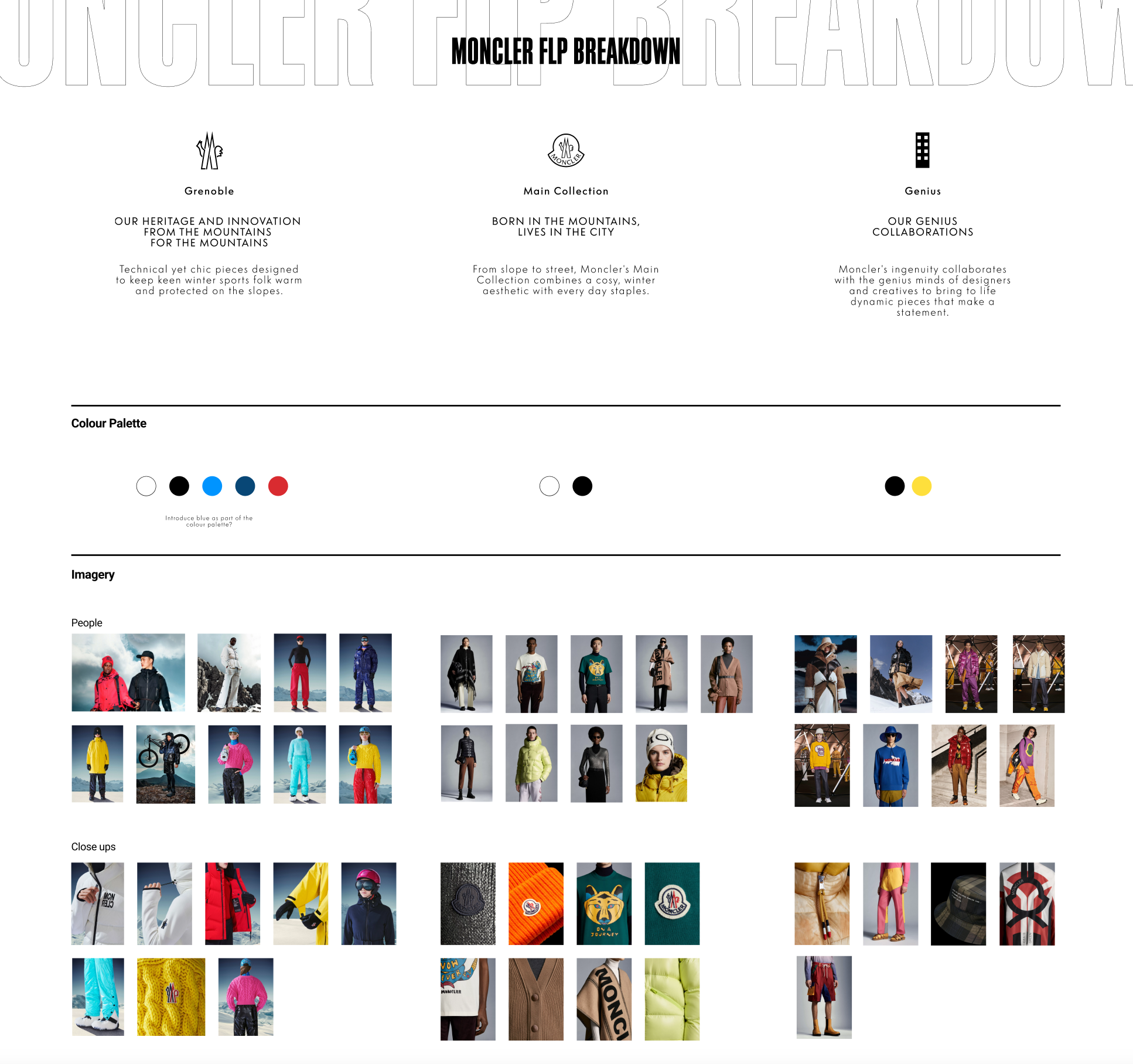
In the latest years Monlcer has been strategically expanding the collections offerings in 3 pillars: Moncler orginal, Moncler Genius, Moncler Grenoble.
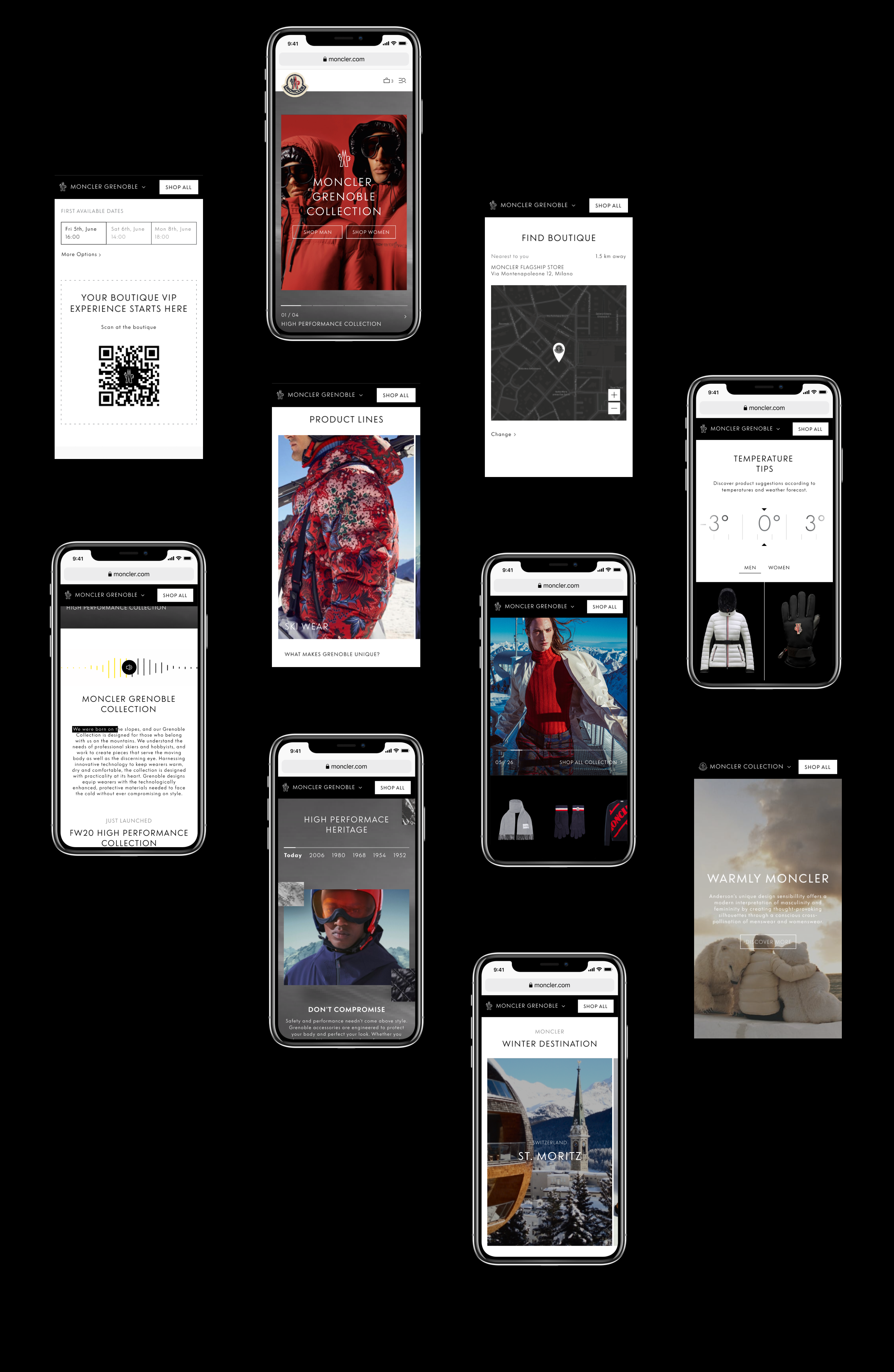
The scope of this project was to look holistically at how customers could engage with the 3 different collections, understand differences providing an clear narravite with evocative storytelling.
Role
Experience Design Director - Freelance.
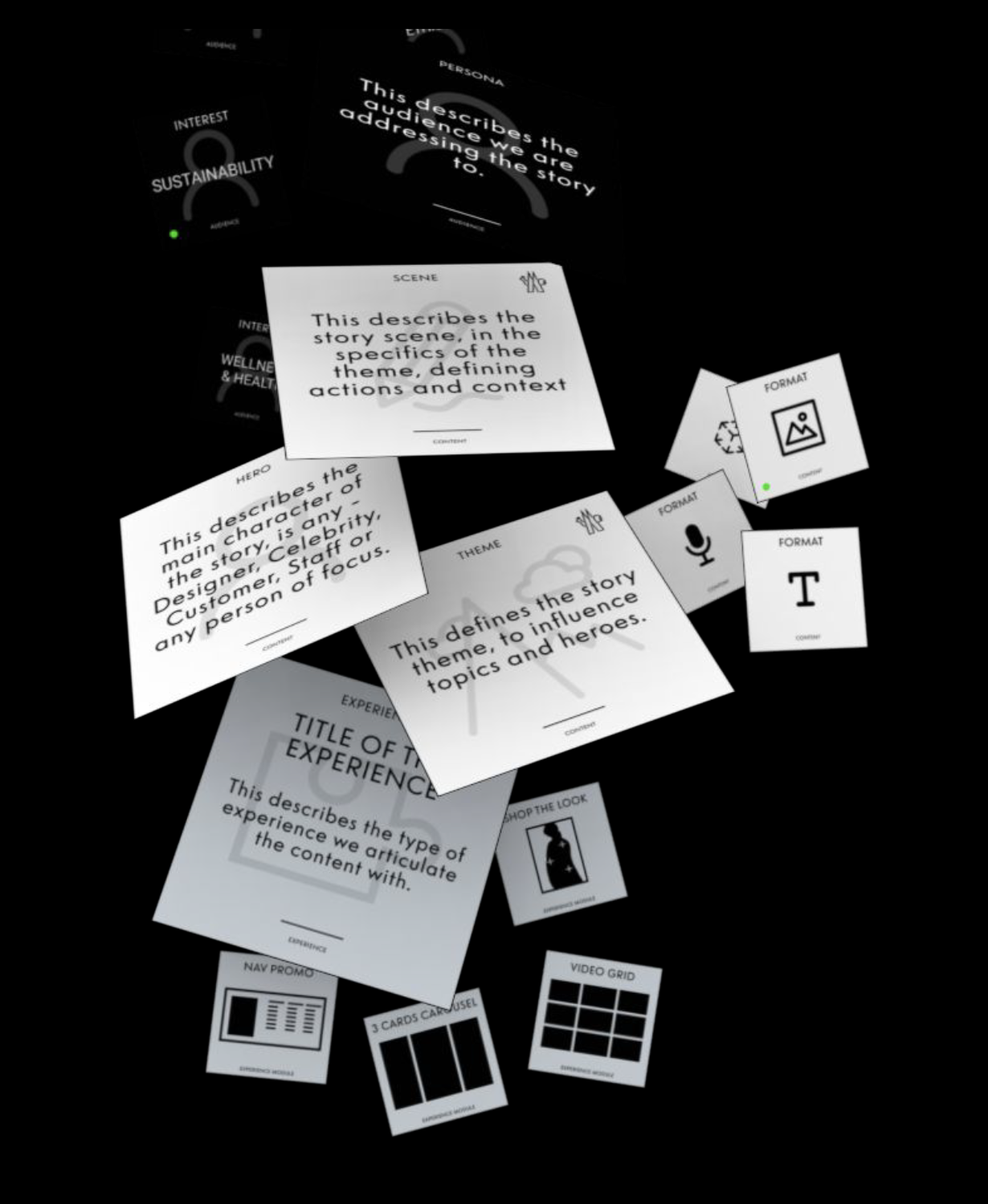
Working on UX foundation, concept workign closely with strategy and Moncler internal UX team. Looking at the design definition across the whole journey - from audit and benchmark to design solution and vision definition as well as collaborating on the content creation tool defining to empower Moncler's internal team to create stories around collectiona and products to better serve and connect with customers on digital experiences.
The Challenge
The Challenge
The Challenge
It’s more than a navigation challenge. There is lack of connection between each collection and the content isn’t immersive or interactive enough. We don’t create enough reasons for our audience to spend time with us and return.
Explore and define a deeper .com content experience focused around the meaning behind our ‘Moncler collections’ leveraging interactive storytelling, visual navigation and in-page drivers.
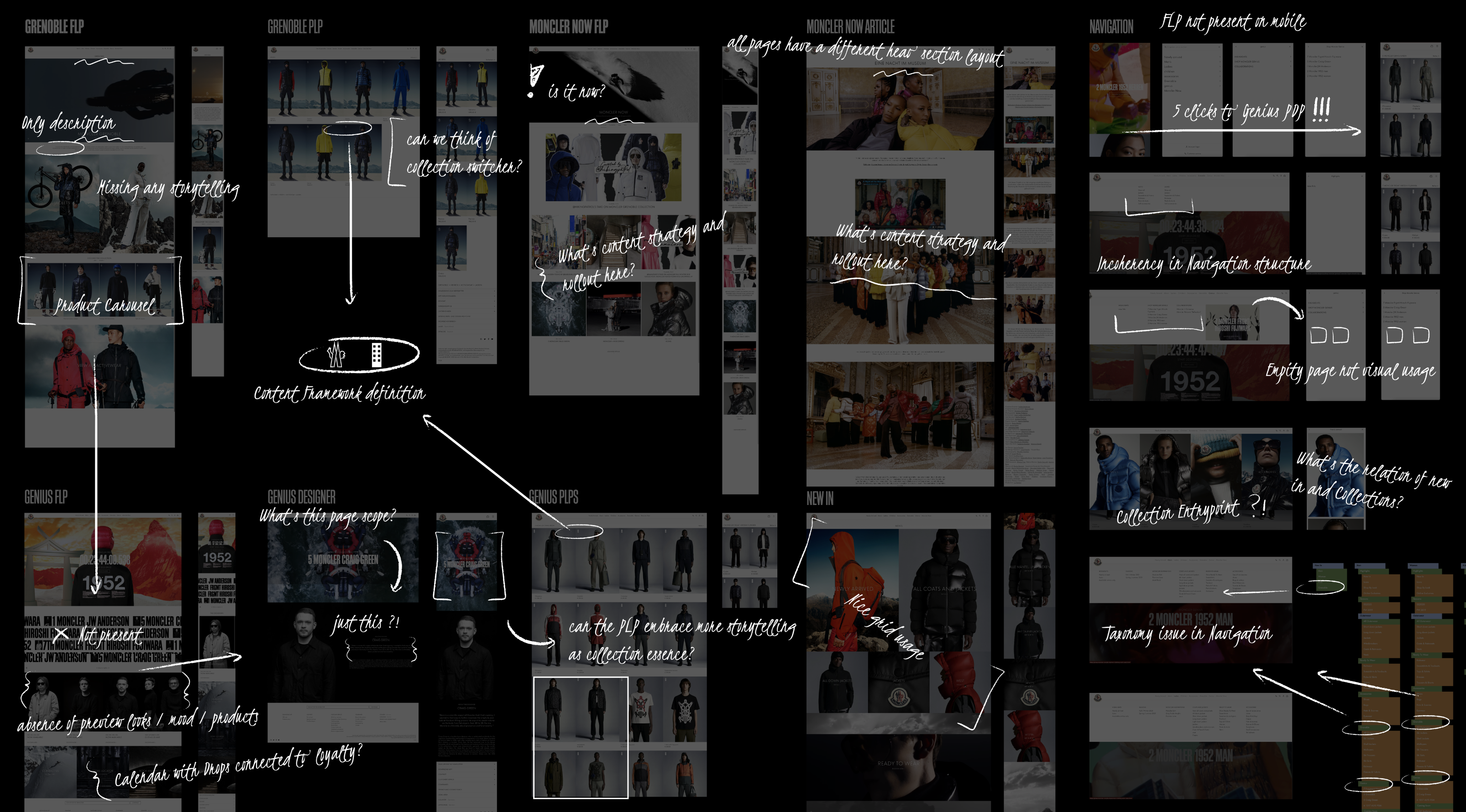
Collections engagement Audit
Best practices
↓
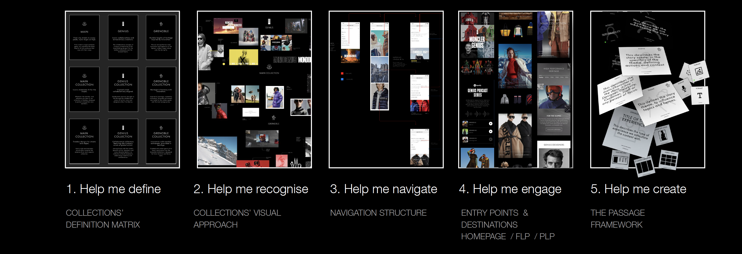
Approach definition accoss CJs
experiences and development tools for content creation
↓
User Journey
↓
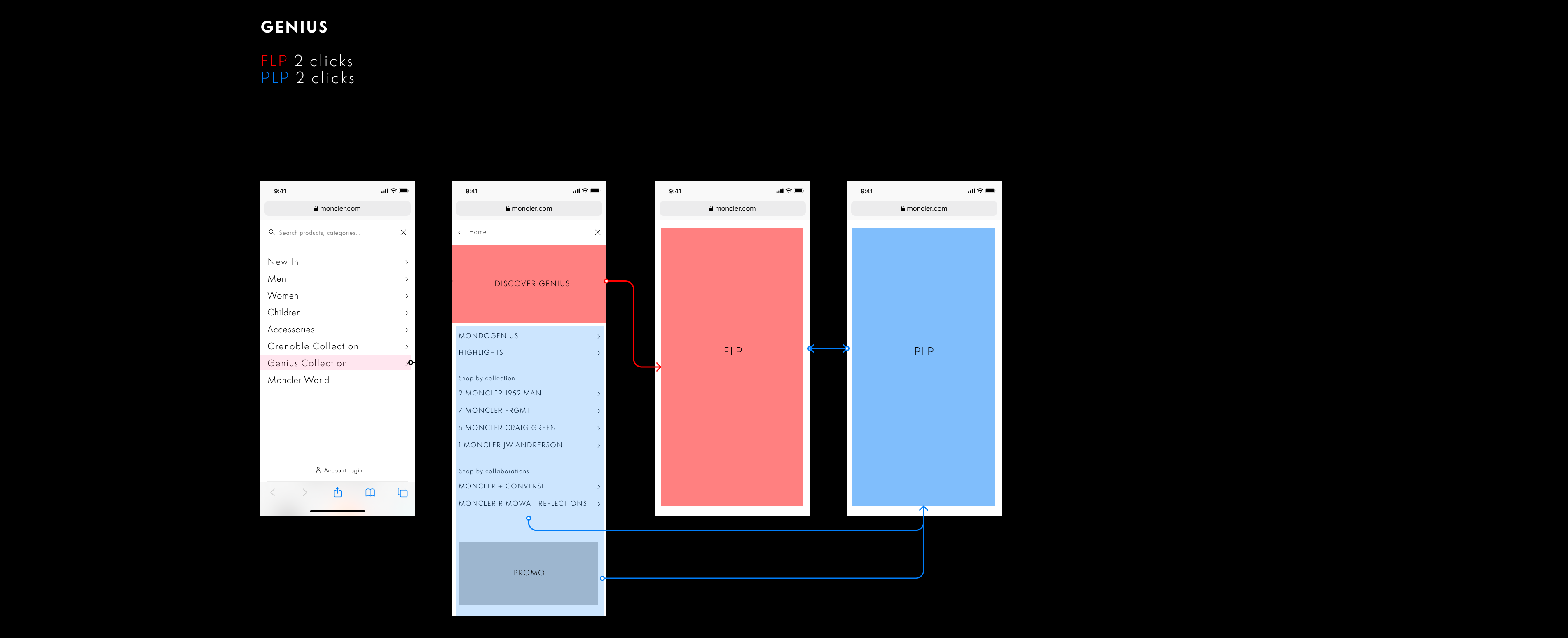
Navigation improvements
↓
User Journey
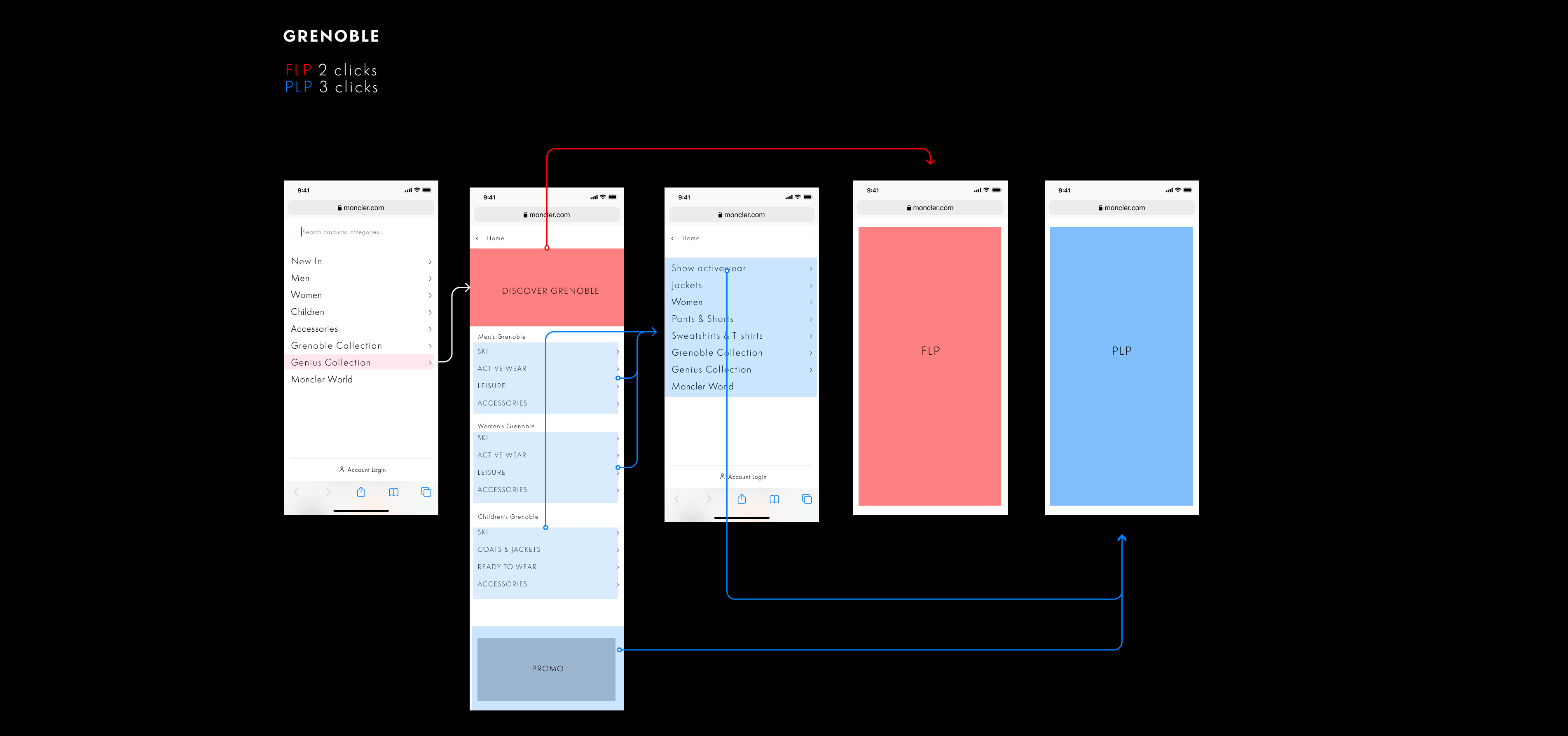
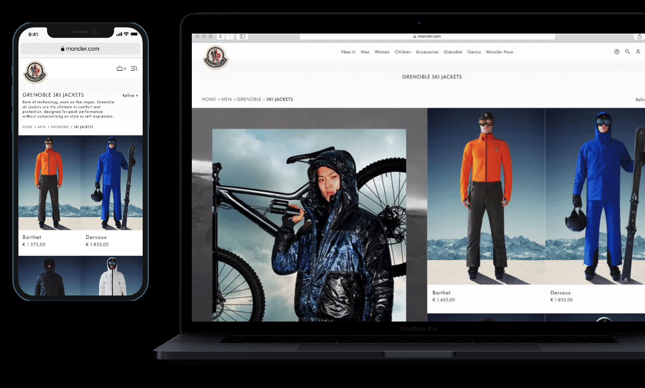
Looking at navigation gaps expecially in mobile, reworking on taxonomy while simplifing the interactions and click to land on desintation pages (FLPs - PLPs)
↓
Defining collection's unique
Visual Lenguage
↓
User Journey
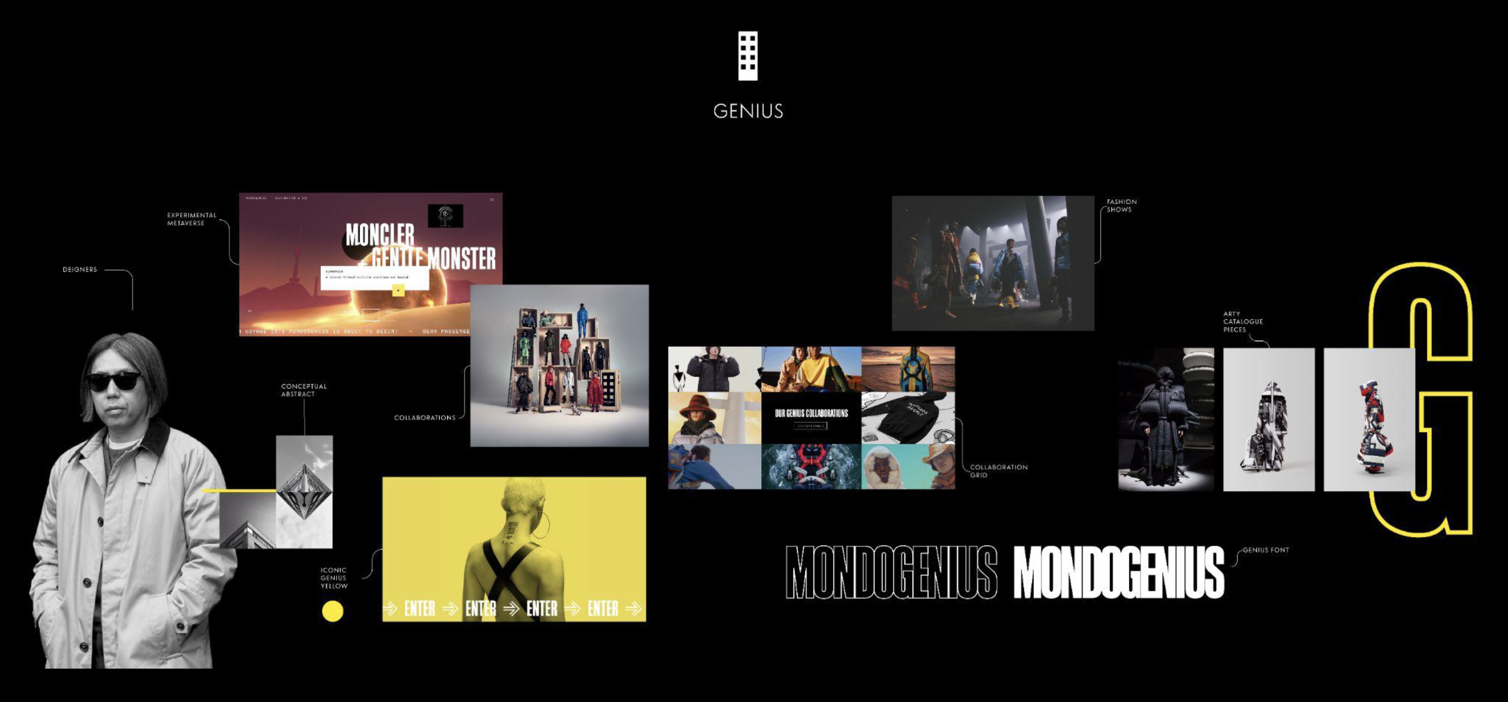
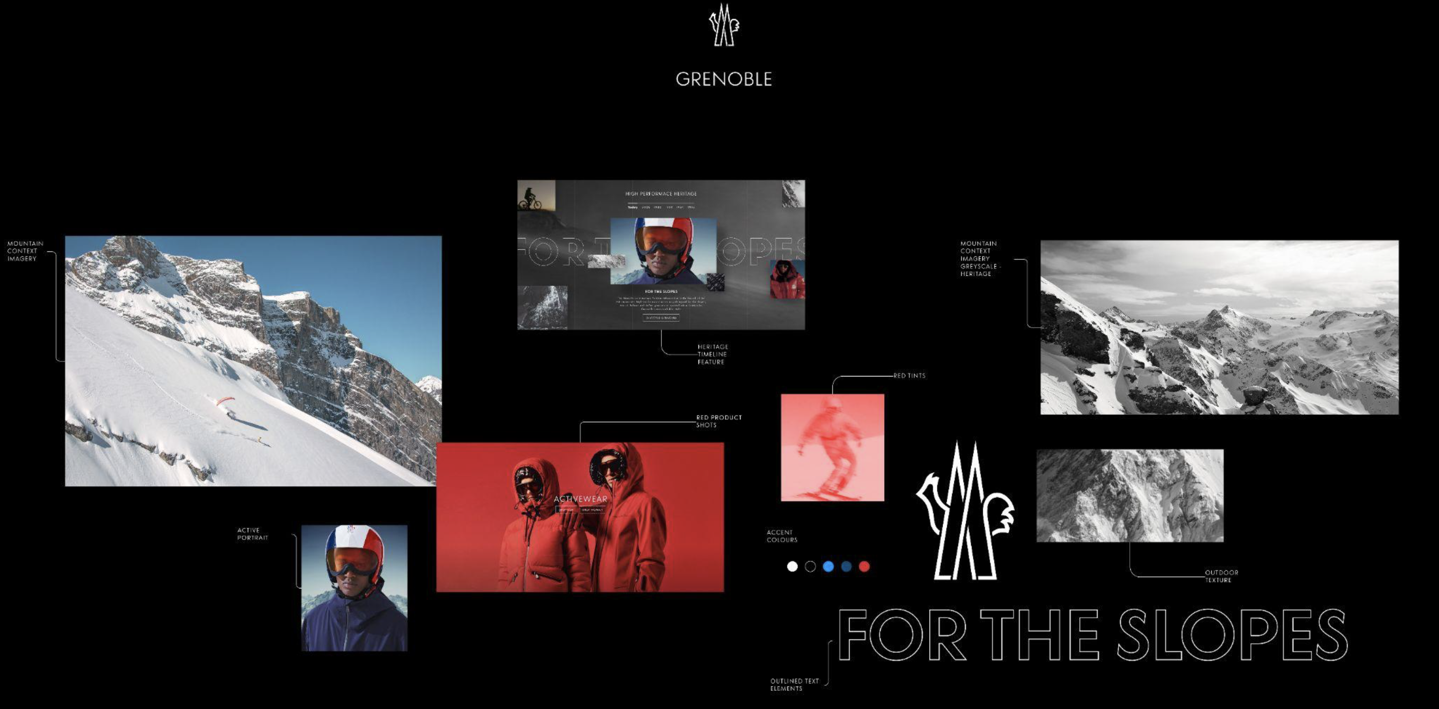
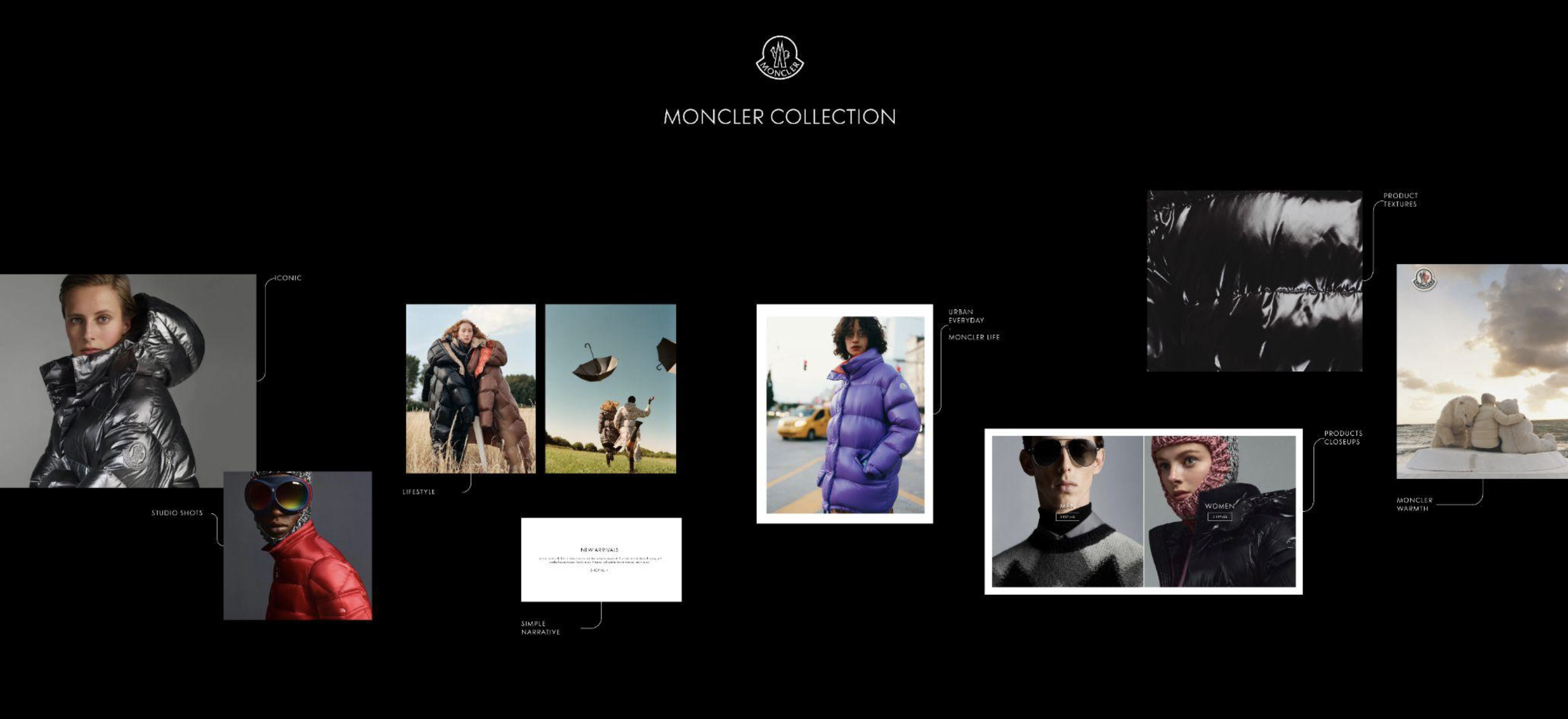
Collections engagement entrypoints
Homepage restructure
1st time visit
Handshake experience
1st time visit
Handshake experience
Handshake experience
Redefining homepage structure and narrative with a clear modular collection based sections the narrative help users connect with collections and products they like.
↓
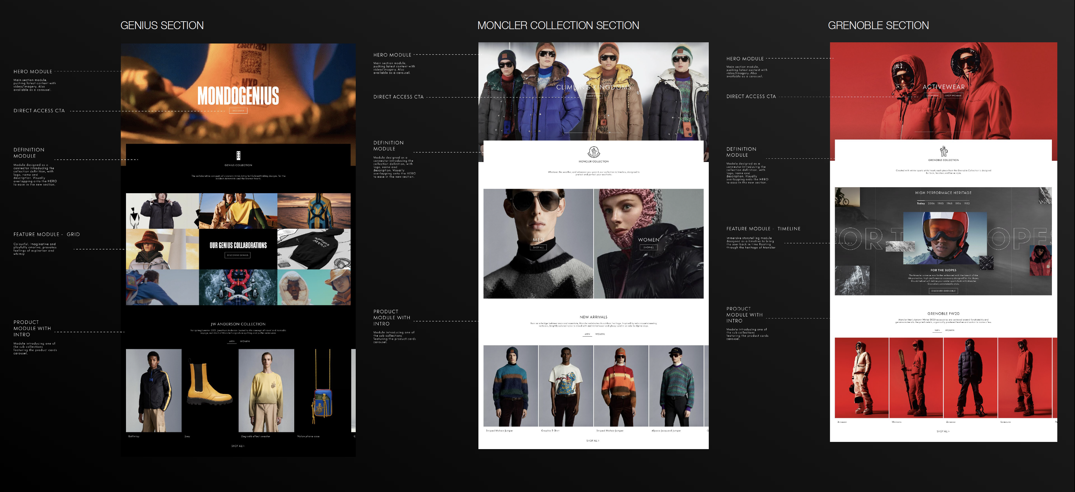

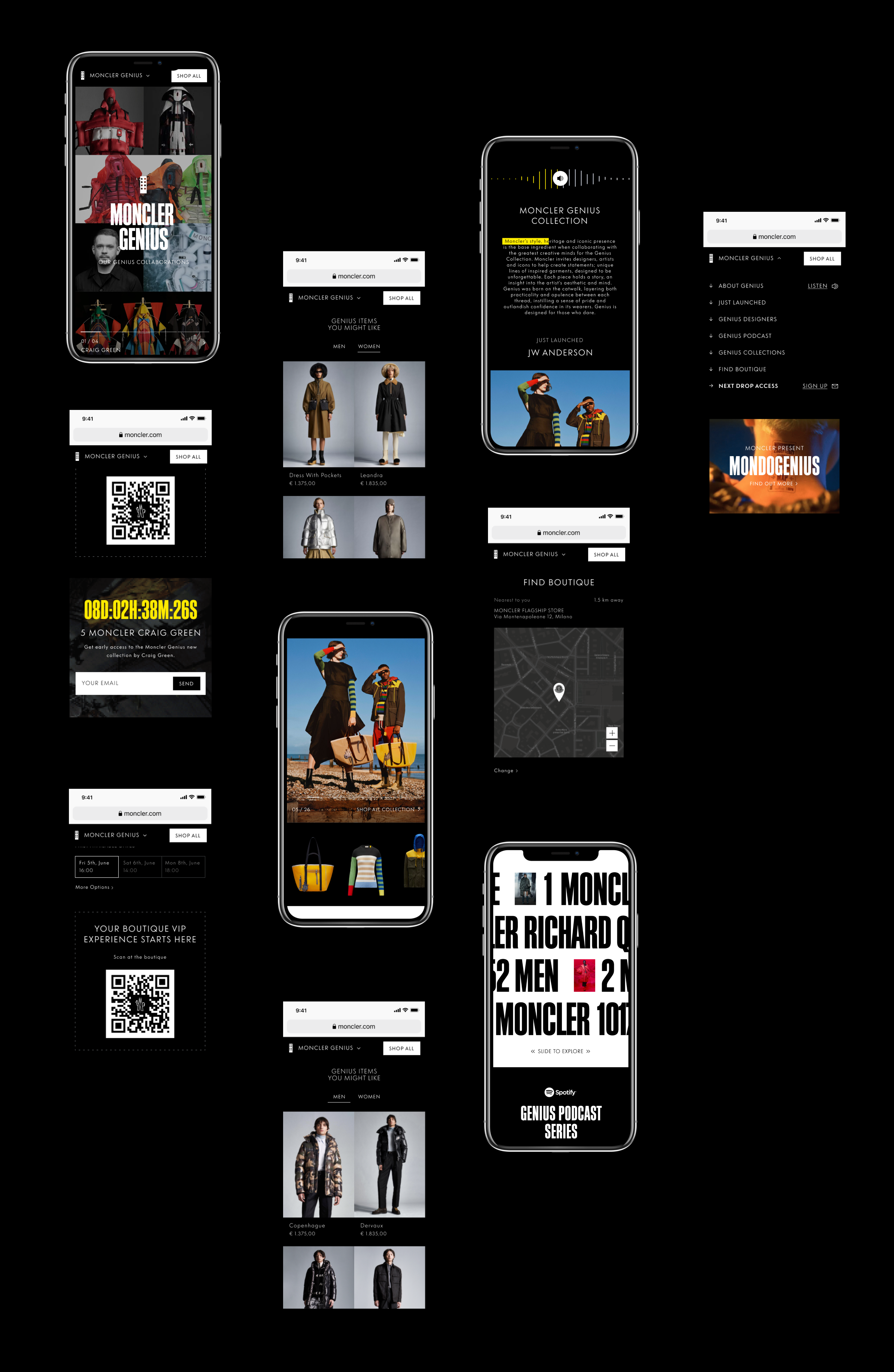
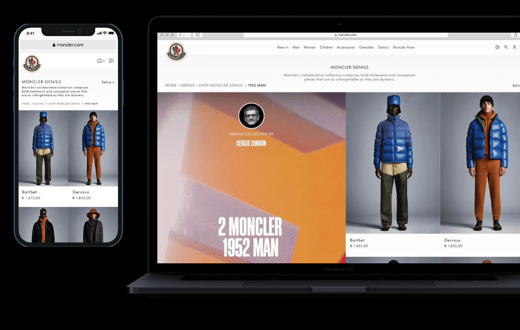
Collections unique modules as
Signature Moments
Contextual framework
Contextual Framework
Exploring and testing a contextual controls framework able to surface control settings according to media in the given viewport.
↓
Exploring and testing a contextual controls framework able to surface control settings according to media in the given viewport.
↓
Exploring and testing a contextual controls framework able to surface control settings according to media in the given viewport.
↓

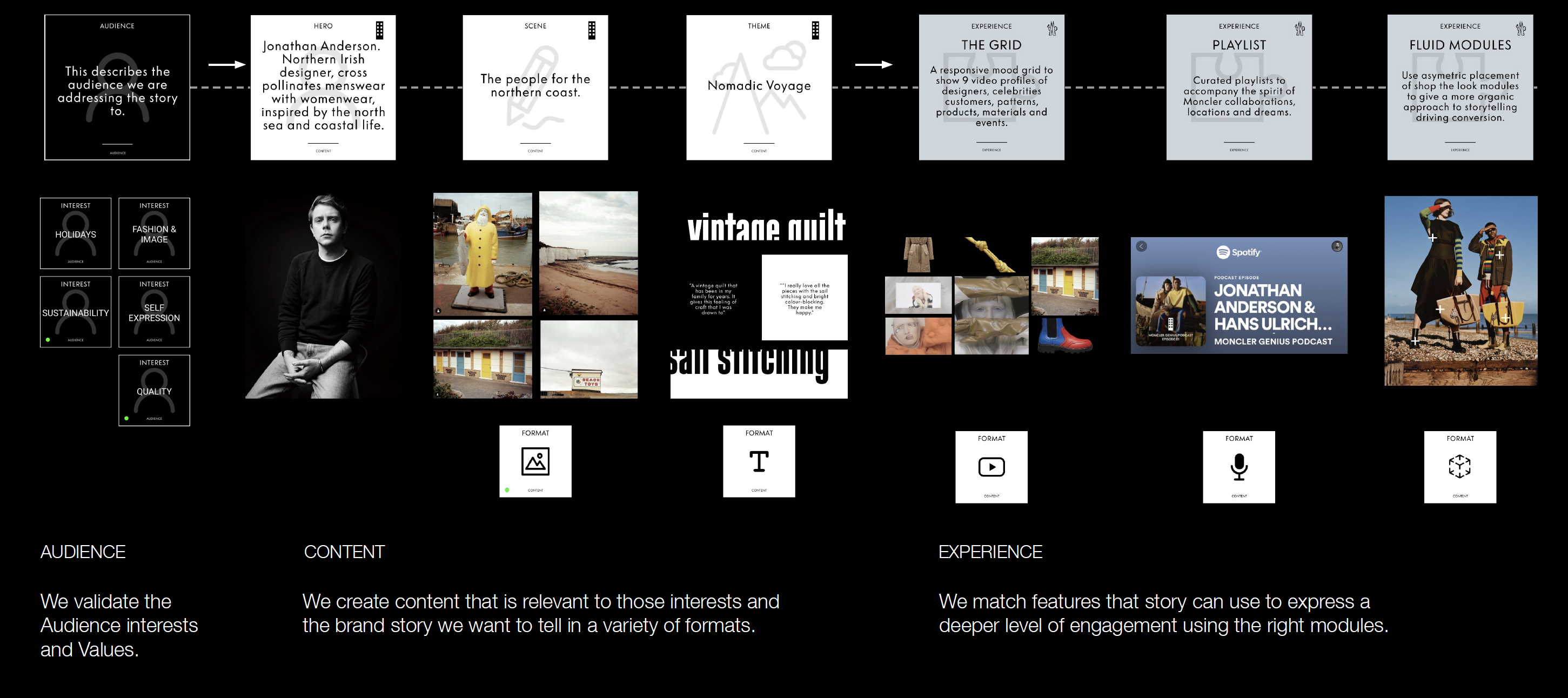
Content Framework
Evaluating existing content
to define new creation tools
Design rewamp
Final Design
Exploring and testing a contextual controls framework able to surface control settings according to media in the given viewport.
↓
Consolidate and reduced experience released during the accessibility day, empowering VI users to better experience online artcle reading with an enanched storytelling
↓
Design Team
↓
R/GA LONDON
Creative Director: Igor Pancaldi
UX Director: Gianpaolo Tucci
Senior VD: Anthony Cheng
